

UX DESIGN PROJECT
Project Type: A Conceptual Project Project Duration: 6 Weeks
Overview
The "Cook book" is a recipe app that lets users find Healthy recipes by calculating how much nutrition should they take daily, find the recipes easily, choose, save them and buy the ingredients of the recipes from the nearest stores.
Problems
-
Most people refuse to eat plant-based foods due to a lack of knowledge about the nutrition facts of plants.
-
Many patients and People with food allergies struggle to find delicious healthy recipes and fresh ingredients according to their diet preferences.
-
limited time to go shopping and creating shopping lists
Solutions
-
Users can select their dietary preferences and preferred measurement systems in their profiles.
-
They will only see ingredients that fit their preferences.
-
They can find the nutrition facts and calories of each recipe.
-
Shopping is more comfortable because of a built-in shopping list. Users can add the ingredients from recipes to their shopping list.
Users
This app gathers a diverse range of recipes. Anyone who likes healthy, pure, step-by-step recipes can use this app. This app is for People with some food allergies, for those who want to lose weight and be aware of the nutrients they take in each meal.
My Role
As the UI/UX Designer for this self-initiated conceptual project, I was involved in the entire process, including the overall strategy, user research, information architecture, user testing, interaction and, visual design.

MY APPROACH
THE DESIGN THINKING PROCESS
These methods and approaches put design at the forefront of the product development process, which I follow to create products that are suitable to meet a user’s needs and more likely to be the best possible solution.
UNDERSTAND
OBSERVE
POV
IDEATE
PROTOTYPE
TEST
Inspiration
Conceptualisation
Iteration
Competitive Analysis
Ux Analysis
User Interviews
Task Analysis
User Personas
User Stories
Site Maps
Usability Testing
Low, Mid & High
Fidelity WireFrames
Prototype
A/B Testing
OUTPUT
PRESENT
Exposition
Final look
Take Away
Conclusion

UNDERSTAND
COMPETITIVE ANALYSIS
HEBBAR'S KITCHEN
My App will share the same strategy of showing various healthy dishes with step-by-step photo cooking recipes like them, but I would like to include the definitions of nutrition contained in each meal. Besides, my App will help users who need to know how many calories they need daily. It will support personalized healthy diets. I am planning to add a shopping option for each meal and send the food to the users.
Hebbar's Kitchen's main objective is to "make healthy food recipes easy and enjoyable." They provide a pictorial representation of recipes along with short videos.
Key
Objectives
They have an Excellent rating on the app store (32k people 4.7/5 Stars) and google play (55k people 4.8/5 Stars)
Overall strategy
This app is popular for a wide range of recipes from different parts of India and their cuisines. However, it also offers other international recipes.
Bottom Lines:
-
Frequently added new recipes with Notifications
-
Detailed ingredients list
-
Dedicated section for videos to browse
-
Save or Organize recipes
-
We can share feedback and add comments to the recipes
-
Select recipes according to the reviews
-
Share recipes with our friends
-
Ultimate cooking and kitchen tips
Marketing Advantage
UX ANALYSIS
Usability
-
Users are warmly welcomed and take required basic information about their health condition
-
Suggest meal plans and recipes for the users according to their requirements
-
Users can sign-up for free and enjoy the trail access for few days
Layout
-
App has a white background with a minimal design which help users painlessly focus on things they need
-
The app includes a shopping cart and navigation footer
-
Filter and sorting options to avoid some unwanted ingredients
Navigation Structure
Compatibility
-
Simple and effective navigation footer which has a home button
-
Shopping cart to shop the required ingredients
-
Search icon
-
Categories option to divide all types of food recipes and helps users to search required items easily
-
Filter and sort icons to filter recipes that have unwanted ingredients
-
Icon to access saved recipes even in offline
IOS and Android devices
OBSERVE
USER INTERVIEWS
I conducted user interviews by reaching out to four people who already are following a healthy diet and those who want to change their food habits due to some health problems
User Interview Goals
-
Understand user's goals, needs, and motivations concerning their nutrition habits.
-
Understand what tasks and where users would want to accomplish.
-
Explore opportunities or gaps in competitive apps by understanding user frustrations, triggers, and preferences.
Key Findings From User Interviews
-
They all want to learn the nutrition facts that they take from the meals.
-
Cooking and shopping take too much time.
-
Hard to find healthy vegan recipes.
-
The app should motivate people by showing you environmental and health effects.
-
Considering their health by calculating the calorie and nutrient values.
-
Filter and sort unwanted recipes based on ingredients and nutritional values

POINT OF VIEW
USER PERSONAS
Creating user personas and defining their personalities, habits, goals, and needs from the data I collected helped me stay focused on users' needs throughout the process. Considering user persona profiles, I created user journeys for each persona to help me see their goals and needs.


IDEATE
TASK ANALYSIS & USER FLOWS
By deriving user flows and task analysis for each persona by understanding their behaviors and goals, I was able to identify each step a person would take to accomplish a task by working through user flows and task analysis.
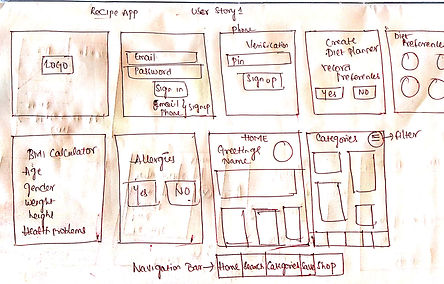
USER STORY -1
As a user, I want to be able to find the recipes according to my diet preferences by filtering out the unwanted ingredients that I am allergic to and shop the required ingredients
ENTRY POINT
Login Screen: Returning User
Sign-Up Screen: New User Success
CRITERIA
-
The Users can find the recipes according to their Preferences
-
Able to filter ingredients they are allergic to
-
Shop ingredients from the list.
STEPS
-
Welcome Screen
-
Sign-In/Sign-Up
-
Home Page or Personal Information
-
Categories
-
Select required categories
-
Click the Filter icon to filter the main ingredients in the Recipe
-
Recipe page
-
Check the ingredient/Steps to follow/Nutritional facts about the Recipe
-
Shop ingredients if needed
FLOW CHART


PROTOTYPE
RAPID PROTOTYPING
I generated Low-fidelity and Mid-fidelity Wireframes through a rapid prototyping process. The wireframes went through many iterations to evolve into a high-fidelity prototype.
LOW FIDELITY WIREFRAMES


MID FIDELITY WIREFRAMES


HIGH FIDELITY WIREFRAMES


TESTING
USABILITY TESTING
I Performed a Contextual Inquiry method to test my High fidelity prototypes. I asked the participants to use the prototype and interviewed them. I collected their feedback about the design and redesigned it by fixing the errors.
TARGET USERS:
I Selected some communities of people who need a recipe app and collect their responses. College Students staying in hostels and paying guests, people moved to new countries, Bachelor job holders and, newly married couples are my target users as they need recipe apps more than other communities of people who cook daily. So I mailed my prototype to them and received their feedback.
SOME USEFUL REVIEWS

Ram Hanuman Rekadi, Decathlon,
Hyderabad.
Shopping ingredients from the nearest store, cooking the healthy and delicious recipes as per our B.M.I solve many problems. Very nice design concept and, this app can work in the real world. Keep it up.

Venkat Sai, Business,
Chirala.
The idea of filtering recipes as per the user requirements is incredible. Overall design and flow of the app are great. It can be better if you change the font size of the options on the filter page.

Vijay Ram Bogi, T.C.S,
Bangalore
I see that you have had a clear vision of the user flow throughout your app. when it comes to design, the green color looks dull for the recipe app. You could change it to some vibrant and attractive colors. Also, you can change the style of the font so it may look more elegant.

Maha Lakshmi Gogula, M.B.A,
London
Everything is fine but the icons are edgy and big. It would be better with some modifications
A USER'S RESPONSE FOR THE PROTOTYPE

Yogendra Yellavula,
M.sc Agriculture,
Dublin

The concept of step-by-step photo recipes and shopping for ingredients from nearest stores saves a lot of time and effort. Calculating B.M.I. and analyzing user preferences is a great idea. But, it can be better if you ask users about their opinion before recording their diet preferences.
QUESTIONS ASKED DURING THE INTERVIEW
-
What is the best recipe app you have used so far? What makes it the best?
-
What are the things that need improvement in this 'Cook Book'?
-
Are they any features that need to be add?
-
What do you think about the design and overall flow of the app?
-
Do you feel any difficulty in understanding this prototype?
THINGS THAT NEED IMPROVEMENT
-
The navigation icon's shape and size need to be reduced.
-
The icon font style needs to be changed.
-
Change the Font Size and style on the filter page.
-
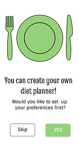
Need to ask users whether they want to create a diet planner or not by adding a page before Collecting their diet preferences
-
Change the design flow at the Filter page while filtering the ingredients.
A/B TESTING
I made some changes in the app design and user flow from the suggestions I got from the usability testing. Through the A/B testing method, I showed the prototypes to my family and friends and compared the new pages with old ones to check the effectiveness of the design.
OLD HOME PAGE
RESULTS: 40%
Heading
Font : Smythe,Regular,48
Side Heading
Font: Smythe,Regular,24
Photo Link
Font: Smythe, Bold and Regular,36
Overall Font Color: HEX #000000

OLD WELCOME PAGE
RESULTS: 10%
FONT: Smythe,Regular,48
COLOR: HEX(#95D178)

NEW HOME PAGE
RESULTS: 60%
Heading
Font : Cinzel,Bold,36
Side Heading
Font: Cinzel,Bold,24
Photo Link
Font: Cinzel, Bold and Regular,24
Overall Font Color: HEX #000000

NEW WELCOME PAGE
RESULTS: 90%
FONT: Cinzel,Bold,48
COLOR: HEX(#95D178)


FINAL OUTPUT

What I learned from this project
Working on this project from start to finish over six weeks with a human-centered approach has made me appreciate the process. I have learned how constant valuable feedback is while designing and how necessary testing is for the evolution of the product. I also learned how to accept constructive criticism.